Thursday, 29 November 2012

Practicing Ancillary Tasks 1

After researching into the CD covers, I have begun looking further into the process and started to make basic covers which could be useful in our final product. I chose a random shot of Alice from the first go at filming just for practice. I decided to use Photo Shop to edit the background of the image, and then transfer the photograph onto In Design to add text. I will experiment with this photograph until we have our own photo shoot with Alice, as I need to practice so I am aware of what types of photographs I would want in the final product.
 
I have looked into copying the same picture next to each other so I can begin to look at copying different pictures on top of each other once I am able to do this properly.
This is my first attempt:


I am aware that this is not very good, however by copying the image back onto itself this has given me experience and I will now go on to try and copy other images onto the same photograph so I can be sure of what I would like my final ancillary product to look like.
 
I have continued to look at two different images from the first shots of filming as they are of Alice's face. I have used the 'clone tool' to copy one picture onto the other, however I am not pleased with the result, maybe once we have done a photo shoot and I have better photographs to work with it could look better, but at the moment I am unsure on this idea:
 
 
I think the images look to clear cut and messy, I will try and make it more transparent in my next attempt:
 
 
This image is a bit too close together in my opinion and I have now been made aware of how to layer images on Photo Shop and have managed to create this image below.
 
 
I have carried on to add a third image of Alice of her looking an opposite direction to match the one I have researched on Ellie Goulding:
 
 
The square outlines on the second and third layers is something I will ultimately change however, for a start I think that this is a good attempt and links well to my preliminary research into CD covers. I will continue to practice these ancillary task images until I am happy with the outcome.
 

Monday, 26 November 2012

Specific Photograph Research

I have started to look deeper into close ups and mid close ups of particular artists in order to give me ideas for my ancillary task of creating a CD cover. I have particularly looked at Ellie Goulding and her photo shoots, which I think will work well with our model, Alice. As they are both young and have blonde hair, we could also dress Alice to the same styling as Ellie Goulding if we wanted to use her as an icon.

These are the images I have been most interested in after researching:


I think the effect used in the two images above of the model moving and the camera capturing the picture to create the blurred image works really well and I think if I was able to create this for an album cover then it would hopefully be quite successful and I will try to achieve some type of research on how to do this soon on my blog as I feel it would be an interesting cover.

I like the close up shots in particular as they are more personal and I think they will work well with our music video song choice as the lyrics are personal and convey a lot of strong emotion. I think that the background in the photograph should be simplistic and not very busy as the main focus should be on the model and the message they are giving out with their song title. 

The main focus in the majority of these photographs of Ellie Goulding are her eyes and hair and I feel these are her main attributes and this could also work very well with our own model, Alice. Hopefully after this research I will be able to compare my own photographs to those I have researched to see whether or not I can fully achieve my ideas.


I have also done some minor research on an artist called Birdy, she is a fairly low key artist however I think that she has similar features to Alice and although they have different hair colours their hair styles are quite similar. Her album covers are also very simplistic, which I like as they convey a certain message to her audience.


Her expression in the photographs look quite solemn and naturalistic which I think is good as the song we have chosen to use is not very upbeat or too heavy. I particularly like the way in which her CD covers are presented with the main focus being on the image and the artist with the busy-ish background blurred out or just a plain background which allows the audience to focus just on the artist. The fonts used are very similar and I think that they fit well within the layout and I would appreciate being able to achieve something similar to this in my final product.

Research for Ancillary Task: CD Cover

Whilst producing a Music Magazine, me and my group also need to create two separate products. We need to make a CD Album cover and an advert for our music video in the style of a magazine advert. My group and I have discussed this and we are all going to make separate ancillary tasks and then compare them together in order to either choose our favourite one or create one together using aspects of the singular ones we have made.
I will firstly begin to research CD Album covers and decide which are the ones I feel will fit our music genre the best. The genre we are focussing our music tasks around is Indie Pop, I will research some Indie Pop artists and their CD covers in order to point me in the right direction when creating my own products.
I began to research general Indie Pop CD album covers and found these were the ones I liked the most:


I focussed mainly on the simple covers, with just the image and artists name as I thought it was most effective and allowed the viewer (me) to focus mainly on the photograph and the album title which is the main aspect of having an album cover. I like the way that bright colour is used against the stark black and white in these images, as it brings the veiwers attention to certain aspects of the photograph. I will hopefully acheieve this in my own work.
I then began to look at the artist that we have chosen, Pink, and to research her album covers. As we are using her song 'Less Than Perfect' I thought it was appropriate to have a look at her covers and how she interpreted her lyrics to arrange an album cover.

This is the single cover that Pink produced for the song that we have chosen. I really dislike this cover, I think it looks quite bland and tacky. Although it has used the aspect of colours along with black and white, however the colour scheme used and the photograph chosen, in my opinion, do not work well together. 


This is the back case of Pink's album cover. I think that the colours used are simple and work well however I think that the font is too close together and not very easy to read. However, I think the idea of using a different yet similar font for each individual song title is a good idea as it conveys the different meaning of each song.


 This is another single cover produced by Pink. I like the idea of using a pattern on the cover, however the photograph is unappealing to myself and I also dislike her outfit. Her pose is quite provocative and considering that our model is Alice, being younger than Pink, I doubt that we will have her positioned like this.


Pink is in the same position in this cover aswell, however he outfit is more revealing and she is facing the camera. I like this cover more, due to the colours used the layout of text and image together however I am still unsure of her pose and the composition of how she is presented as a whole.

After briefly researching into album covers, I will now go on to looking more closely at the way artists are presented in photographs on cd covers and how we are going to present Alice too. We will be having a photoshoot in the near future to allow us to experiment with different shots whilst decided which we think will work well.

Filming Schedule

We were discussing with our media teachers which rooms were free and when we would be able to film. We will be filming the school scene next in which Alice engages in an argument with her teacher and leaves the room, and we are using our own media teacher. Below presents an email from our media teacher to another teacher asking about free rooms so we are able to plan when we can next film.


From: Mrs K McKenna
Sent: 26 November 2012 15:03
To: Melanie Ginn
Subject: free rooms Thursday 29th period 4

Hi Mell,
 
Would you mind letting me know what rooms are free on Thursday period 4?
 
Thanks
Katie J

Wednesday, 21 November 2012

Update on planning and filming

After looking back at our own work and having feedback from our teacher, we are aware that the scene in which Alice and her mum have an argument is quite unclear. We want our music video to have continuity and run clearly with no confusion, and so we have decided to re shoot the scene, however as this scene follows on from Alice leaving school we will convey Ashleigh (Alice's mum/older sister) to be putting the phone down or receiving a message from the school as Alice enters so that the audience are aware of why she is so angry at her daughter. 
If this is unsuccessful we have been discussing whether or not to change this particular scene to one with Alice arguing with a boyfriend or group of friends. However, we are still undecided on this and will make a proper decision after we have tried our first idea, as we would like to stick to our original ideas.


The image above portrays how I have been communicating with my teacher through Blogger. Also in lessons me and my group have been receiving feedback on our filming and planning. So far, it has been quite successful however we are constantly trying to improve our work. 

Comparing our planning to our work

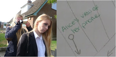
Looking back at the hand drawn designs I have used to convey the scenes in our music video, I will be comparing them to our actual filming to portray whether or not we have kept to our plans. I will be focussing on different camera angles in particular scenes which we wanted to incorporate at the start of the planning process.


I will be presenting the shots we filmed to our planning in each scene; this shot portrays Alice's point of view and the camera will show the image of her phone recieving a text message.


The next scene we looked at was the memory scene, in which Alice will be portrayed in black and white and the camera will convey her at a happier time.


This image conveys the view between two of Alice's friends, showing her in a happier mood:


We then looked at the scene in which Alice returns home from school and has an argument with her mother.


This image conveys the over the shoulder shot of Alice shouting at her mother, which is the same as our planning.


We also looked at the wide shot of Ashleigh laying across the sofa:


I will continue to compare our planning to our actual scenes which we have filmed as we go along, however so far I feel that our planning fits together well with our current work and that we are on target to acheive the music video which we have planned.


Saturday, 17 November 2012

4th Filming - Mum Argument Scene

The fourth section we decided to film to contribute to our music video, is the scene in which Alice enters her home (Jessie's house) and has an argument with her mother. The actress we are using as Alice's mother is, Ashleigh. Considering that Ashleigh is the same age as us, we received some criticism about using her in our video, however after removing her make-up, tying her hair back and dressing her in particular clothing, we feel that she does look older. We are unable to find a willing actress who would look like Alice's mother in our video, and so if these shots are not to our satisfaction we may either have to find a new actress or change the story line to Ashleigh being her older sister as this would be more believable

As Alice is supposed to come from a troubled background we decided to throw clothes around the floor and empty food packets along with beer cans in order to give the right mise en scene for this section of our music video. We dressed Ashleigh in pyjamas and a dressing gown and instructed her to be holding a remote control and beer can in her hand as Alice enters. There would also be a cigarette packet and lighter on the arm of the sofa in which she would be laying on. Alice will then enter through the door and sit on the sofa diagonal to Ashleigh and they will begin to speak to each other. As the audience will not be able to hear the conversation we gave them basic lines to prompt them when acting, as it would make it easier. Alice will then stand up and begin shouting at her mother and the camera will convey her to be the dominant character, however as Ashleigh stands up the camera will portray her as more prominent considering she is the mother. We panned around them both arguing with each other and have a shot reverse shot of them both shouting at one another. Alice will then snatch the beer can out of Ashleigh's hand and kick the empty cans on the floor and storm out of the door again. 

Here are the photographs we took as we were preparing and filming.


 Preparing Ashleigh:


 Ready for filming:

Here are the photograph's we took as we were preparing our location:
We wanted to make the room look unclean and messy so we threw clothes around the floor and used some empty beer and rubbish packets to add effect around the sofa.


During filming Alice and Ashleigh were struggling to argue on the spot, so we decided to give them a rough script to give our scene structure and make it seem more believable.


 These are the photograph's that were taken during filming:


These are the video's we retrieved whilst filming for the fourth time:

These two clips are of a two shot between Alice and Ashleigh arguing


The next two clips are 360 degree pans of the argument:


These are the first shots we tried as Alice enters the room and the argument begins: