Showing posts with label Research. Show all posts

Monday, 7 January 2013

Magazine Advert Research

As a secondary part of our ancillary task we have been asked to create a magazine advertisement to go with our music video and CD cover. We have all researched the magazine advert and discussed how we would like our advert to look, I will then go on to create the magazine advert all whilst referring back to my group for their opinions and changes they would like to make.

We have already discussed this aspect of the overall task and we are aware that this advert will be promoting the music video we have created. Considering that the main emotion throughout the music video is one of vulnerability, sadness and depression we will be using one of the photographs from our photo shoot with Alice that conveys a deep sadness which will mirror the lyrics of our chosen song. 

These are the images that my group and I are most likely to use in our magazine advert:


These photographs portray Alice with smeared eye make up which relates to how she is presented in our music video. We have chosen to dress Alice in the same clothing as it highlights the continuity throughout our music video and would remind our audience of the music video when looking at our magazine advert. 

I will now research real magazine adverts and promotions for music singles and decide which layouts and colours I think work well together in order to guide our work.

General Research:

I began to research general magazine adverts and focused quite intensely on photographs which contain hands and arms as these are the photographs of Alice we have roughly chosen. 

These images of Beyonce are quite plain upon first look however the second photograph contains Beyonce as a different persona with a lot more make up and accessories. We will not be doing this with Alice as we are focusing more on the emotional turmoil of her lyrics in her songs and less on her external image to the public. The use of two CD covers in the corner of the magazine advert convey the continuity between Beyonce's products and we are eager to use this in our own work.


Jessie J also uses her hands in her magazine advert, however her main theme in this magazine advert is attitude and we were not looking for this. The positioning of the photograph is central which is useful as the artist is the main focus. The layout is simple which we liked as a group because we think this may be achievable. The artist is wearing thick black make up similar to Alice's however, Alice's make up will be more smudged and convey a deeper upset.


Specific Research:

I have decided to look more into emotional artists song, such as Adele and in some cases Rihanna, as they focus their promotions on the individual song being promoted rather than an image being portrayed to the public.


Considering that our other ancillary task has been based on the album covers from Rihanna and Adele, I decided to look into their magazine adverts which supported their albums to see how they incorporated their own themes into the production.


After using Google to research Adele's music magazine advert I noticed that her album cover for the magazine was featured on the magazine to highlight the continuity. The pictures are also very similar of Adele looking down with the same make up and slightly different hair style. The advert much similar to the album cover is very plain and simple yet very effective as it highlights that they are representing the same song/songs. The fonts used are also the same including their colours which is useful to know as when creating our magazine advert I will be using the same fonts and colours to highlight to continuity we will have.


Rihanna also has the same featured effect in her magazine advert, although in a different way. The same photograph has been used on both pieces which is the best way to present continuity. The target audience of this music would be able to recognize the photograph immeadiatley and be able to relate the two advertisements together with the artist. The fonts used are similar to the ones used on the album cover which also portray continuity. 

Both artists are also using their hands and arms in the positioning in the photographs much similar to our idea of Alice holding her hands against her head in the photograph. Her make up being smeared is similar to Rihanna's advert, although Rihanna's make up is more prominent. Although the simplicity of Adele's album and magazine cover has influenced our ideas most as this is most similar to our album cover. I will now go on to create our magazine advert, all whilst referring back to these two adverts.


Monday, 26 November 2012

Specific Photograph Research

I have started to look deeper into close ups and mid close ups of particular artists in order to give me ideas for my ancillary task of creating a CD cover. I have particularly looked at Ellie Goulding and her photo shoots, which I think will work well with our model, Alice. As they are both young and have blonde hair, we could also dress Alice to the same styling as Ellie Goulding if we wanted to use her as an icon.

These are the images I have been most interested in after researching:


I think the effect used in the two images above of the model moving and the camera capturing the picture to create the blurred image works really well and I think if I was able to create this for an album cover then it would hopefully be quite successful and I will try to achieve some type of research on how to do this soon on my blog as I feel it would be an interesting cover.

I like the close up shots in particular as they are more personal and I think they will work well with our music video song choice as the lyrics are personal and convey a lot of strong emotion. I think that the background in the photograph should be simplistic and not very busy as the main focus should be on the model and the message they are giving out with their song title. 

The main focus in the majority of these photographs of Ellie Goulding are her eyes and hair and I feel these are her main attributes and this could also work very well with our own model, Alice. Hopefully after this research I will be able to compare my own photographs to those I have researched to see whether or not I can fully achieve my ideas.


I have also done some minor research on an artist called Birdy, she is a fairly low key artist however I think that she has similar features to Alice and although they have different hair colours their hair styles are quite similar. Her album covers are also very simplistic, which I like as they convey a certain message to her audience.


Her expression in the photographs look quite solemn and naturalistic which I think is good as the song we have chosen to use is not very upbeat or too heavy. I particularly like the way in which her CD covers are presented with the main focus being on the image and the artist with the busy-ish background blurred out or just a plain background which allows the audience to focus just on the artist. The fonts used are very similar and I think that they fit well within the layout and I would appreciate being able to achieve something similar to this in my final product.

Research for Ancillary Task: CD Cover

Whilst producing a Music Magazine, me and my group also need to create two separate products. We need to make a CD Album cover and an advert for our music video in the style of a magazine advert. My group and I have discussed this and we are all going to make separate ancillary tasks and then compare them together in order to either choose our favourite one or create one together using aspects of the singular ones we have made.
I will firstly begin to research CD Album covers and decide which are the ones I feel will fit our music genre the best. The genre we are focussing our music tasks around is Indie Pop, I will research some Indie Pop artists and their CD covers in order to point me in the right direction when creating my own products.
I began to research general Indie Pop CD album covers and found these were the ones I liked the most:


I focussed mainly on the simple covers, with just the image and artists name as I thought it was most effective and allowed the viewer (me) to focus mainly on the photograph and the album title which is the main aspect of having an album cover. I like the way that bright colour is used against the stark black and white in these images, as it brings the veiwers attention to certain aspects of the photograph. I will hopefully acheieve this in my own work.
I then began to look at the artist that we have chosen, Pink, and to research her album covers. As we are using her song 'Less Than Perfect' I thought it was appropriate to have a look at her covers and how she interpreted her lyrics to arrange an album cover.

This is the single cover that Pink produced for the song that we have chosen. I really dislike this cover, I think it looks quite bland and tacky. Although it has used the aspect of colours along with black and white, however the colour scheme used and the photograph chosen, in my opinion, do not work well together. 


This is the back case of Pink's album cover. I think that the colours used are simple and work well however I think that the font is too close together and not very easy to read. However, I think the idea of using a different yet similar font for each individual song title is a good idea as it conveys the different meaning of each song.


 This is another single cover produced by Pink. I like the idea of using a pattern on the cover, however the photograph is unappealing to myself and I also dislike her outfit. Her pose is quite provocative and considering that our model is Alice, being younger than Pink, I doubt that we will have her positioned like this.


Pink is in the same position in this cover aswell, however he outfit is more revealing and she is facing the camera. I like this cover more, due to the colours used the layout of text and image together however I am still unsure of her pose and the composition of how she is presented as a whole.

After briefly researching into album covers, I will now go on to looking more closely at the way artists are presented in photographs on cd covers and how we are going to present Alice too. We will be having a photoshoot in the near future to allow us to experiment with different shots whilst decided which we think will work well.

Friday, 9 November 2012

Time Ellipses in Music Video's

Considering that we have decided to use two time ellipses in our music video, we thought it would be a good  idea to convey our memory scene in black and white, as this would allow the audience to understand what was happening in our music video. The scene we are editing into black and white contains Alice in the common room with her friends at a happier stage in her life, I decided to research different types of music video's which use this aspect of time ellipses in their work to present how we would want ours to work.

I have researched into Katy Perry and her song 'The One That Got Away' the video portrays an older lady looking back on her life and the loss of her partner at a young age. The present day is shown in stark white colours compared to the past of her youth shown in some sepia tones and grey scale. The older character also has a sadness to her appearance which is in the present, this is useful as this is how we are presenting Alice in our video. Her past is being presented in a sepia tone in the Katy Perry video, her character is younger and happier in these scenes. We will be showing Alice at a happier time in our video and this will be clear from her change of clothes, her emotion towards others and the colour in which the video will be presented. Researching colours used in other music videos has allowed me and my group to fully understand the outcome of our decisions and we feel that this will work really well with our idea.


We will be using this in our own music video to represent Alice in a happier time compared to her current situation. The black and white scenes will convey Alice's memories, they will be shot at school with other girls in the common room. She will be wearing different clothes which will portray her to be in a different mood compared to the stark white shirt she is wearing in the rest of the music video.
 
 
We will be editing the clips of Alice in the bright colours into black and white to convey her memories, however it will still be clear to the audience that she is in opposing clothing. The final memory scene will be in all black and white, conveying Alice as follows:


Monday, 22 October 2012

Mise-en Scene

During the course of our video we will need a few props in order for our story to be realistic and make sense to an audience. Since we have chosen to focus our video around isolation of a young girl, and the influence of drug and alcohol abuse we will be using empty packet of pills and alcohol bottles to influence our video. We have been using 'Popplet' to plan which types of things we would need to bring with us to filming each scene, so far we have only shot one scene which did not need many props, however our other scenes are set in different environments and will need a variety of props.

The Bedroom Scene:
The starting scene of our video is the same as our ending scene, and so this will need the most cutting and editing. In this scene we are starting with a close up of empty alcohol bottles and pill packets scattered around Alice's bedroom floor, conveying her destruction. The camera will then pan around the room presenting Alice lying unconscious on the floor after an overdose. The scene will then fade to Alice being at school, starting the course of her 'bad day'. The props we will need in this scene are presented below:


The School Scene:
The school scene is the scene shown after the starter portrayal of Alice unconscious on the floor. It will begin with a shot of the whole class room and Alice being clearly alienated from the others, it will proceed to the teacher in a tilted view, almost like a worms a view shot, shouting at Alice from her point of view and this will then change to the teachers point of view so that the viewer can see Alice's expression. We will be switching the shots of Alice from different angles to convey how alone she is in the classroom. During this scene, we will be using our own media class in the video and out media teacher has agreed to acting in our video. We will need normal wooden desks, some books/folders, and pupils in the classroom.


The Home Scene:
After Alice walks out of school and storms down the lane, there will be a scene with Alice and her mum. Alice's mum is being played by a fellow media student, Ashleigh, who is seventeen although we will dress her to look older than her age. Considering that our video is centring the idea of abuse etc we decided to convey Alice's mum to be uncaring and also an alcoholic to show that this is an ongoing problem for Alice and not just a teenage tantrum. We have decided to have Ashleigh perched on a sofa, in a dressing gown and pyjamas surrounded by alcohol bottles and cigarettes. We feel that this will convey her attitude well, we may also be having a scene with Alice and Ashleigh having an argument. 


Letter from OCR

Considering our chosen music choice contains swearing throughout we wondered whether or not it would be acceptable to use the explicit version or not. We asked our teacher if this was useable or not and she decided to email the examiner in order to be sure, as we would not want our coursework video to decrease in grades because of our music choice.
 
Here is the letter that OCR sent in reply to our query:

After much discussion we have decided not to use the explicit version, the song is still the same the only words that have changed are in the chorus which change from "F***ing Perfect" to "Less Than Perfect" which will not change the course of our work, it has just cleared up a query and made us more clear and set on our music choice.

Monday, 15 October 2012

Research into Main Character


In our music video there will be 1 main character and 3 to 4 other characters who will appear at some point in the film. We have discussed in detail the clothing and appearance we would like our characters to portray in each scene, as the story line conveys the turmoil of a teenage girl she will look evidently 'worse' in each scene leading up to her overdose.
Here is a mind map showing the appearance we would want each character to have in each scene:


In the original music video written and produced by Pink, Max Martin and Shellback contains a main character around the same age as our chosen main character, Alice Hall. The girl tells the story of depression, self harm, isolation and ultimately recovery, played by Tina Majorino. Our music video will highlight the struggles of being a teenage girl, focussing primarily on depression and being isolated from friends and family. 


We felt that by using this song by Pink, we would be able to successfully compare our video to the original, although by changing the storyline and characters we would make our own version conveying these emotions in a different way. As Pink and her team had more experience in video making and technology they were able to create a time ellipsis of a woman's life, however, we will not be able to do this considering our limitations and time scale. And so, our video will contain one main character, Alice, following her through a journey of depression starting at school and ending on the floor of her bedroom unconscious surrounded by alcohol bottles and pills.

Tina Majorino has dark hair, pale skin and fits the stereo-type of an 'emo' quite well considering her clothing and attitude in the video. 


This image presents Tina in the original video, she has dark eye make up and a sad expression. We have planned to give Alice this type of style, and asked her to portray a character similar to this, as we would like to highlight depression and hurt in our own video.


Our chosen main character, Alice, was a fellow media student and understands the importance of our coursework video. This conveys that we can trust her to maintain a steady character and be reliable enough to come to filming sessions. We chose Alice as our main character because we thought that she would fit the character well and portray the part well. 
Alice looks nothing like Pink's chosen character, however, I see this as a positive as it allows us to create our own story without having every aspect of our video the same as the original. At first we were rather sceptical of having a blonde main character as we though someone with darker hair would look more emotional and combined with darker clothes would present a more troubled person, however, being blonde, Alice fits our character really well. 


This is a photograph we took of Alice during our first set of filming. My group are content with our choice of main character and ensure that Alice will help us to produce a good music video.

Clothing:

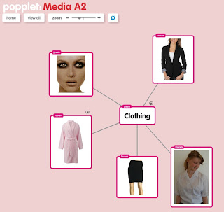
We first started to plain our characters at the start of our course and had plenty of ideas to do with clothing, make-up and hair. We decided to make a 'Popplet' page in order to maintain all of our ideas in our work. We have used 'Popplet' to mind map our ideas to do with clothing and the items we would need in order to make our video consistent.

These print screens present the work we have done on Popplet, to do with where we would get the clothes from, why we want them and how it would change our video. This is the main mind map to convey our ideas with clothing.


We were also able to upload images on to Popplet in order to convey each of our ideas to the mind map and what we imagine the character should be wearing. This was very useful as it helped us to realise and agree on the style of which we should dress Alice. We have agreed that Alice should be wearing a black skirt, black blazer, tights, back shoes and a white school shirt. We decided that this was plain enough to not be complicated, but smart enough to look as if Alice was in sixth form. During filming the lane scene we asked Alice to take her blazer off in anger whilst walking down the lane. We decided this would be useful as the viewer would watch Alice angrily remove her blazer and throw it behind her, by doing this she is conveying her emotion to the audience.


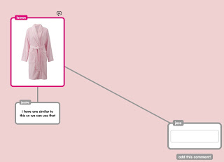
Further to this, we also made comments on the images in the mind maps to tell each other whether we could contribute to bringing in clothing or props to help with the filming. This dressing gown will be used by Ashleigh, Alice's Mum, whilst we are filming one of the ending scenes. She will be lounging on a sofa or something like that as Alice walks through the door to see her. We have styled Ashleigh to look quite rough and uncaring, as this would add to the emotion of Alice's character of having arguments with friends, teachers and a non-supporting mother role.


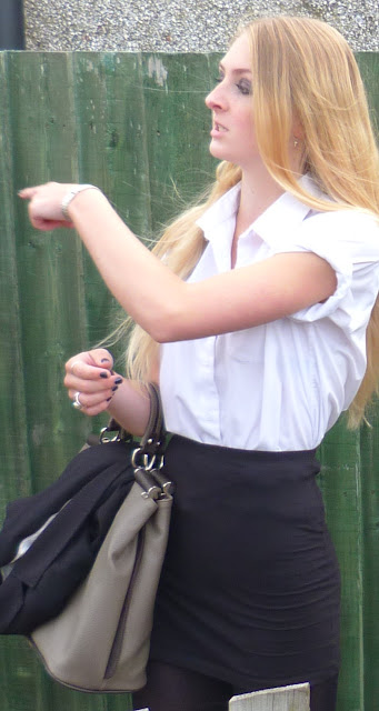
 Before filming we informed Alice of the clothes that we would like her to wear certain clothes and in my opinion the clothes were perfectly suited to our ideas. This picture was taken during our first filming as Alice was angrily walking down the lane after she had walked out of school. We have filmed this scene twice now and the shots are getting better as we are getting used to using the camera and we are pleased with how Alice is portraying our main character.


We decided to roll up Alice's sleeves on her plain white school shirt as it conveys her 'bad' attitude towards school, and is not as business like as most sixth form clothes that students are expected to wear. Her bag is also quite small and more of a handbag than a school bag, this also portrays her attitude as she is not interested in school and is holding no folders or books. It is also clear here that Alice is wearing some jewellery such as rings, earrings and a bracellet. Her style is quite 'indie' and not academic.


This mid close up of Alice presents her school shirt and blazer, this shot is taken from when Alice is looking down at her phone as she has received an abusive text message. Her appearance is quite anti-school as she has quite heavy make-up on her eyes, jewellery and an unbuttoned collar. We are planning on putting Alice in these clothes throughout the whole video as she will be easily recognised by the viewer, however as the video continues Alice's clothing will get scruffier and she will remove her blazer presenting her deteriorating emotional character.

Make-Up:


"After researching many of Pink's music videos, we noticed that her make up is usually quite minimalistic yet very dark. We have decided to give Alice dark eye shadow and mascara to portray her emotional mood. As the music video continues we will smudge parts of the make up to highlight the fact that Alice has been crying and is in emotional turmoil with her friends and family. Here are some examples of dark make up which we have researched and are planning to compare Alice to."


We have planned to give Alice dark eye make up to compare her to Pink's videos. It would also incorporate the idea of her depression and anger with the dark colours.


Avril Lavigne is an artist with blonde hair, a bit brighter than Alice's, however she mainly wears dark eye make up and so we can use her as a image to style Alice against. Her style is a typical 'moody teenager' and she portrays this is the majority of her songs and music videos.


So far, we have filmed and planned her appearance around this research resulting in her make up being dark like this image below. We are content with Alice's make up and will convey her deterioration throughout the music video by making her make-up more smudged and messy to show her emotions.