Showing posts with label Editing. Show all posts

Saturday, 6 April 2013

Editing the music video

The editing of our music video was the most crucial aspect to our coursework and so we needed to be sure that it went accordingly and linked back directly to our planning. The first thing to that needed to be edited was the actual music itself as we did not need to use the whole file. This was done by using a 'Fading' technique. We used this to build tension in our music video and this also gave us continuity as we used this effect at the beginning and the end of our music video. By using a pan and establishing shot at the beginning of our music video it allows the situation to be introduced to the audience and our main character is evident from the outset.


To make our work load more manageable we decided to name each individual shot we achieved to ensure that we did not miss any important shots.


As we were planning to put a separate music file behind our edited shots it was important that each shot we placed in Serif Movie X3 had the sound behind it removed. This meant that the music file we chose to use would be the only file heard.


Becoming familiar with using Serif Movie X3 allowed us to play around and experiment with the shots we have gained in order to improve our overall video. By slowing down the pace of some of the shots we were able to focus more attention on certain aspects of our video. We did this with the close up shots mostly as this focused attention on Alice's movements and decisions, such as having a slowed pace close up of the pills which Alice swallows, as this is a climaxing part of out music video. Slowing down the pace of some shots also improved the quality of our filming as the occasional shakes from us holding the camera were diminished which allowed the video the appear more professional. We used this effect throughout the video to gain suspense and tension.


Throughout the video we used either sharp cuts or cross fades as these are quick paced which link to the beat of our chosen song. The most successful cross fades are those which go from the starting shot to black and then to the following shot and this improves our overall continuity. We used this transition shot during the video between Alice being in the bathroom to her sitting on the bench waiting for her friend; continuity is clear here as the transitions link to the transitions in our locations.


As well as enabling us to change from scene to scene, using the cross fade technique allows us to create successful transitions from shot to shot in the same scene, such as when Alice is looking at her reflection in the mirror we wanted to allow the audience to see this in many different angles. We also used this when Alice steps into the bath as at first the audience can see a side shot of Alice and this cross fades to a mid shot and birds eye view.


These are some more screen shots which convey our use of the cross fade technique:


As our song choice focuses highly on Alice's fast paced decision making based on her turbulent emotions we felt it was necessary to produce a music video with fast paced cuts to different shots of Alice's face which convey her emotions. By allowing our shots to move quickly we can create tension within our music video and link it directly to the lyrics in our video. Quick cutting shots presents Alice as frustrated and a build up of urgency links well with our video and we felt that this would work well in our final product. 


One of our main problems during filming was the effect of using natural light within our video. As we did not have enough lightening equipment to produce a completely professional video we had to rely on the natural light entering the bathroom and re shoot thoroughly to make sure that the shots conveyed continuity. The screen shot below portrays a shot which was far too bright compared to the rest of our video:


In order to overcome this issue without re shooting the shot again we decided to experiment with some lighting effects on the shot to match them to the rest of the  video. By using a 'half an half grey scale effect' we were able to dim the lighting in this shot which allowed the shot to look similar to the rest we had previously filmed. 


This effect was extremely successful as by using 'half and half' we were able to match the shot to the rest of the scene and the use of effects was not obvious to the audience.


This effect has allowed us to convert the majority of our scenes to the same colour as external factors such as the sun going behind the clouds in our bench scene meant that it was near impossible for all of our shots to be exactly the same brightness. Due to the colours outside being varied compared to the bathroom we had to use another effect called 'brightness and control' on these shots to allow them to all look the same.


Instead of decreasing the brightness we decided to increase the contrast function which worked better. This can be seen in the shot below when Alice tries to hold Jessie's hand, this is a focal point in our video and so this shot needed to be good. By increasing the contrast to 20 we were able to adjust the natural lighting to one which worked best for our video, giving us a successful result. 


By linking all of our shots together it enabled us to create a good quality video, as if one section of our video did not flow with the rest it would evoke confusion from our target audience. By cutting from scene to scene in different locations such as the class room and bathroom scene we asked Alice to do the same movements with her hands in her hair to allow the audience to become aware of her distress and the actions conveyed continuity throughout our work.

By using quick cutting towards the end of the video we were able to focus the attention of the video on Alice's face and her inner emotions. By linking all of the scenes together at the end of the video we are conveying the story in a fast paced way to show how Alice's emotions has stayed the same throughout the whole of the video, we did this by cross fading and cutting each shot quickly.


Learning to use Serif Movie X3 has allowed us to create a successful, in our opinion, music video. Using several editing techniques which have been displayed in the above post has allowed us to understand the production element to real media products and appreciate the dedication it takes to create music videos.

Wednesday, 27 March 2013

Creating Magazine Advert

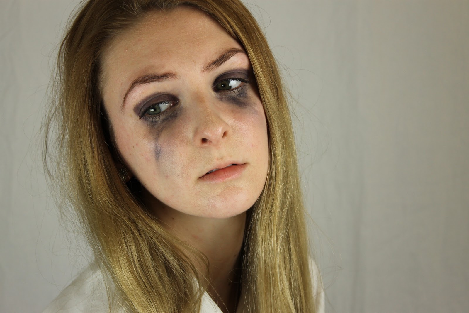
The secondary part of our ancillary task is to create a magazine advert promoting our music video. Considering that our music video centers around distress and sadness we have based both of our ancillary products on this and have therefore made the photographs in black and white and some of the photographs convey Alice with smeared make up which relate back to our music video. As a group we chose the photograph which we thought would work well to express the whole feel of the album and song itself. We chose a photograph of Alice holding her hair up with a sad look on her face as she does this repeatedly in the music video.


The screenshot above portrays the photograph we chose to use in black and white which has been edited in Photo Shop. 


We decided to have a black background for our magazine advert as it links back to our CD cover which also has a black background. The actual photograph being in grey scale stands out more as an affect of this. We achieved this effect by using the 'Paint Tool' and 'Eraser Tool' around the edges of the photograph.


Highlighted above in the red rectangle conveys the areas on the photograph which were hardest to edit. For the image to look professional on the final cover we had to use the 'eraser tool' to create a smudged effect around the photograph. We got this idea from our research into the Adele magazine advert.


Placing the photograph on In Design on the black background highlighted the minor details which needed to be changed in order for our magazine advert to look professional.We were unsure of were to place the photograph as being close up, the top of the photograph was evident.


By opening the photograph on Photo Shop again we were able to adjust the outer spacing around the photograph and use the 'Eraser Tool' to create a bigger smudged effect and highlight Alice in the image. By using this effect on the photograph we are portraying Alice as the most important figure on the advert. This conveys continuity to our music video as the whole video is centered around Alice and her emotions.


The photograph was then placed on In Design again however the top of the photograph was still noticeable which we did not feel was professional. The only way we would be able to overcome this problem was by decreasing the size of the magazine advert, which in fact worked best for our advertisement as all of the information we needed to portray could still fit on the advert.


To keep strong continuity throughout our ancillary tasks we used the same font, colours and spacing on both of our ancillary products. This allows our target audience to relate both products together and become aware that the magazine advert is promoting the main song on our CD cover. The above screen shot conveys the texts we have used which are exactly the same on both products.

This was our predicted final product, however we received negative feedback from our teacher which suggested getting rid of the white outline as it did not look professional. 


I began editing the original photograph in order to get rid of the white smudged background. I did this on Photo Shop by using the 'Eraser Tool'. I have conveyed my editing in the screen shot below by highlighting the background behind Alice's arm in a red rectangle. It was extremely difficult to edit as I had to be sure that I did not erase away part of Alice's arm.


After removing the white edge around the picture I placed it back on the original magazine advert and as a group we decided to add more text about the product to increase interest in the final product as we thought it looked too plain.


I have highlighted on the screen shot above the changes that have been made within the production of our magazine advert. We centered the image of Alice to make her the most prominent feature on the advert as the advert is promoting her song. We added ratings from popular music magazines and newspapers which allow a link to be made into real media products as we have seen this on real magazine adverts in our research. We also changed the colour of the 'Available now' text box to draw more attention to the fact that her songs are available for purchase, we changed it to red which links with the red 'A' on the album front cover. We also added a 'Debut' text box with a date of release for the whole album so that our target audience of teenagers and young people were aware of when the whole album will be out for sale. We have used the same font throughout our whole production of both ancillary tasks as this promotes strong continuity and allows our target audience to link all of our products together.


I have highlighted above the similar factors between the newest magazine advert with our other ancillary task. By using the same features on both products we are able to link all of our work together to convey a clear thinking process. We aimed for our products to link together well in order to promote a strong product, we have used a picture of the frontal album cover on the magazine advert so that our target audience are aware of the album that is being promoted. We have also used the same 'SONY MUSIC' text from the CD disk and back of album cover on the magazine advert to portray the music company which links to real media products. By making these changes to our magazine advert we have been able to create a more professional looking advert and it also looks less plain and simple by adding more information about the product we are promoting.

This is our final magazine advert:


Creating Spine of Album

Our Digi pack has four aspects which need to be completed, they are the front cover, the back cover the CD disk and the spine of the cover. In this post I will convey how I created the spine of the cover. This was the most simple aspect of the Digi pack as it was the smallest. Considering that the album was in itself black and white my group and I decided to make the spine black with white writing. 


The print screen above conveys the black spine of the album and the white writing which resembles the artists name and album name. We have used the same font throughout the whole ancillary task to convey continuity and to allow the audience to become aware of the artists style. I have highlighted this in the print screen above by framing the specific parts in a red square. 


This is the finished spine of the album, it relates to the rest of the Digi pack and they all fit well together. I have used the exact same font, size and spacing between letters as the front cover to provide strong continuity throughout our product.

Creating the CD disk

As well as creating the front, back and spine of the album we also have to produce a CD disk to go inside the album case. We decided as a group to produce a simple disk which relates to both our music video and our Digi pack. As the majority of our Digi pack is black we decided to have a black disk with white writing. The font used is the exact same as the front and back cover which conveys our continuity throughout the ancillary tasks. 


After spacing out the text using the 'Character' box on In Design I was able to place the text at the top of the CD so it would be the first aspect of the disk that the audience would see. We used an extra white circle in the middle of the CD to break up the dark colour.


We prominently based our CD disk layout around the Rihanna 'Talk That Talk' CD disk as we thought this layout suited our theme best. The dark background matches our photographs and other ancillary task and by using the same fonts we are able to convey strong continuity. We have placed the name of the album and artist name in the same place as Rihanna however we have switched the two to make the album name more prominent as this is the main focus of the album and our music video. We also added the producer information and broadcasting details at the bottom of the CD covers copyright laws, this is a direct link to real media products.   


This is our final CD disk:


The plastic behind this CD disk will be clear with no colour because we do not want anything to distract the attention away from the CD disk - we also feel as a group that this would be the most professional outcome on our final product.

Wednesday, 20 March 2013

Creating Back of Album Cover

When creating the back of the album cover my group and I have had to choose another photograph from the ones we have taken and I will then go on to produce the back of the album cover based on our research.
We have decided to use another photograph of Alice with no smeared make up and those are for the magazine advert, as they represent the song we used in our music video and by using one of Alice with normal make up, we are giving the impression that not all of the songs on the album are as depressing as the one we have chosen.
We have decided to use this photograph of Alice as she is in a different position and has a different expression on her face, although it will take a lot of editing to sort out the background. We are basing the back of the album cover on the research we have recently completed from artists such as Adele and Rihanna.

After some discussion we came to the conclusion of not using this photograph as Alice is not facing straight towards the camera and the editing was becoming too difficult. We wanted an image which was not as similar to the front cover and so without her hand on her face. I attempted to get rid of the chair behind Alice using the Clone Tool in Photo Shop, however it just made the image look worse.
We chose this photograph as it was different to the front cover and Alice has a different expression, although she has smeared make up this could convey her main single on the album.


As a group we have previously decided that we wanted our album cover in black and white much similar to Adele's as we thought it looked more professional and had a deeper meaning than the more powerful colourful images.


By opening the picture in Photo shop I was able to use the effects from the program to edit the image into black and white, and use the different effects in order to get the right amount of white to back contrast on the photograph.


I experimented with a few of the effects however after asking the opinions from the rest of my group we decided on using the 'Halftone Pattern' effect as it made the photograph lighter as well as in black and white. This was the photograph after I changed the colour effects:


After looking back at our research into back of album CD covers I noticed that the main background colour was black. I like the way that in Adele's album cover the back image has a smudged effect which I would like to incorporate into the final product as it looks more professional and less tacky. I will try to incorporate this by experimenting with the background colour to make it darker. 


I changed the effects of the background at first so I could change the colour afterwards. I left the outline around Alice's face so it would stand out against a darker background. I did this by changing the diameter of the brush size and making the hardness of the brush a little less to create a blurred effect around Alice. The background of the image changed into grey and white checkered squares to highlight the effects I have made.


In the image below I have highlighted the areas which were most difficult to edit as Alice's hair was quite messy and back combed and so I had to zoom into these areas and carefully edit them to make them less messy.


I used the paint tool to create a black background on the edited photograph. It was simple to use and improved the image immensely in my opinion. The colour used is the same as the album cover from Adele and I feel works well with the chosen photograph as Alice has smeared black make up around her eyes, which conveys her sadness and the colour black is known to be linked with deep emotion.


The edited image below was the outcome after I had changed the background colour. I showed by group this photograph and they were pleased with the progress. I am happy with the outcome as Alice is dominant in the photograph and her emotion and facial expression relates to the music video we made and the theme of the whole album.


I then opened another page in the same program, and began to create the other aspects of the back cover such as song titles. My group and I decided to use the same font on the back cover as we did on the front to convey continuity to our target audience. We decided that the album should contain ten songs altogether as it was practical, we used song names from a range of albums by Pink, the artist of our chosen song, to be sure that all of the song titles were linked to sadness, anger and vulnerability. This meant that the whole album would have strong continuity. 


After changing all of the song title fonts to the same as the front cover I decided to 'Place' the edited image of Alice onto the cover so I could visually see the layout on the screen.


I chose the edited image from my saved files and dragged it into the position on the back cover. I also moved the song names to the top as they were hidden under the photograph after it was place.


Once I had placed the photograph I noticed that the top and bottom of the photograph were visible on the black background and so I asked my group how to overcome this. Lauren suggested moving the image higher and leaving a gap at the bottom, Jessie then agreed as this would leave space for more writing and information about music producers etc which the other album covers have. I then continued to move the photograph to the top of the cover and add more aspects to the image.


The red rectangle in the image above conveys the difference in colour, however once I have added information about the producing of the music etc hopefully it will not be as visible. If this does not go to plan I will have to add an effect to the photograph in order to blur our the sharp line.


I moved the song titles away from the image so I could focus on the other aspects of the whole back cover. As a group we decided to have Alice's name on the back cover similar to Adele's album. We also thought it would be a good idea as her name is not on the front cover, just her initial. We decided to rotate her name by 90 degrees anti-clockwise which resembles the same layout as Adele's album.


This was the finished image without adding the song titles and information to do with music at the bottom of the photograph. We as a group were happy with this as it resembled the same layout as Adele's. I used the same font throughout however I changed the thickness of the font as I had to increase the size of the word.


I then began to add the song titles onto the photograph closely together, just to see how it would all look. I will carry on moving the song titles until we as a group are happy with their placing. I will probably move them upwards and space them out a bit more. However, Alice's face will still be the most dominant image on the cover.


During the production of the back of the CD cover I asked for some feedback from my group as to how to change some aspects if they were not working well. The main discussion we had focused on the bottom of the photograph as it has a sharp distinctive line near the bottom of the cover. We agreed to fade out the image much like the outside of the photograph. I will now go on to edit the photograph again in order for it to look more professional in the final outcome.


I have highlighted the areas above which I will use to change the photograph. By using a gradient effect on the bottom of the image I will be able to change the photograph and make the bottom of the picture lighter in order to diminish the distinctive line.


The gradient tool was ineffective to our photograph and so I decided to edit the background in the same way I edited the photograph edges by making them softer and so the distinctive photograph line will disappear. I used the areas highlighted in the image above such as colour and paint to change the photograph and make Alice look almost ghostly in the image. I feel this is effective and this image reflects the whole feel of the album and conveys a deep sadness in her expression. I will now replace this image on the final cover.


The above image conveys the final edited photograph on the back cover. My group and I are content with this image as it looks better than the image before. I will now go on to adjust the text around the cover and add the final aspects of the back cover.


I will need to create a barcode on the back cover to make the cover eligible to be sold, I will make the barcode on Microsoft word using the shape tool and will add numbers to be sure that I am not breaking any copyright laws.


The screen shot above shows the bottom of the back cover with the barcode in place. The product would not be able to be sold without a barcode and so can now be comparable to real media products. 


The print screen above portrays the back of cover in its current state, the picture has been placed just left of the center with all of the song names in place. So far my group and I are happy with the progress of this aspect of the Digi pack.


Looking back at our research into back of album covers, I became aware of the bonus tracks that Adele has added to her album which were probably added to boost album sales and may even be songs that were not released prior to the album being sold and so this would provoke interest from her target audience. We have used this aspect in our final back cover to make the album look more realistic and the song names are all from the original artist of P!nk, the singer of our chosen song.


The album cover also needs terms and conditions present on the case to make the audience aware of the copy right laws and the company which have produced the product. I have left a blank space at the bottom of the cover for this information and the writing will all be written in the same font as the rest of the album to convey continuity and have a professional outcome. 


In the screen shot above I have highlighted the way in which Rihanna has set out her technical information on her album cover compared to the way in which we have presented ours. Due to our cover not being a real music album I have used our names instead of real executive producers and given Alice her own website which is similar to both Rihanna and Adele's albums. By having their own website, music artists are able to update their fan base regularly with tour date information and news, they can also do this by social media sites such as Facebook and Twitter.


The image above conveys the final back of album cover. Overall my group and I are very happy with the outcome as we have followed our research carefully and the sketches have ensured that we kept to the layout we had previously planned.