The secondary part of our ancillary task is to create a magazine advert promoting our music video. Considering that our music video centers around distress and sadness we have based both of our ancillary products on this and have therefore made the photographs in black and white and some of the photographs convey Alice with smeared make up which relate back to our music video. As a group we chose the photograph which we thought would work well to express the whole feel of the album and song itself. We chose a photograph of Alice holding her hair up with a sad look on her face as she does this repeatedly in the music video.
The screenshot above portrays the photograph we chose to use in black and white which has been edited in Photo Shop.
We decided to have a black background for our magazine advert as it links back to our CD cover which also has a black background. The actual photograph being in grey scale stands out more as an affect of this. We achieved this effect by using the 'Paint Tool' and 'Eraser Tool' around the edges of the photograph.
Highlighted above in the red rectangle conveys the areas on the photograph which were hardest to edit. For the image to look professional on the final cover we had to use the 'eraser tool' to create a smudged effect around the photograph. We got this idea from our research into the Adele magazine advert.
Placing the photograph on In Design on the black background highlighted the minor details which needed to be changed in order for our magazine advert to look professional.We were unsure of were to place the photograph as being close up, the top of the photograph was evident.
By opening the photograph on Photo Shop again we were able to adjust the outer spacing around the photograph and use the 'Eraser Tool' to create a bigger smudged effect and highlight Alice in the image. By using this effect on the photograph we are portraying Alice as the most important figure on the advert. This conveys continuity to our music video as the whole video is centered around Alice and her emotions.
The photograph was then placed on In Design again however the top of the photograph was still noticeable which we did not feel was professional. The only way we would be able to overcome this problem was by decreasing the size of the magazine advert, which in fact worked best for our advertisement as all of the information we needed to portray could still fit on the advert.
To keep strong continuity throughout our ancillary tasks we used the same font, colours and spacing on both of our ancillary products. This allows our target audience to relate both products together and become aware that the magazine advert is promoting the main song on our CD cover. The above screen shot conveys the texts we have used which are exactly the same on both products.
This was our predicted final product, however we received negative feedback from our teacher which suggested getting rid of the white outline as it did not look professional.
I began editing the original photograph in order to get rid of the white smudged background. I did this on Photo Shop by using the 'Eraser Tool'. I have conveyed my editing in the screen shot below by highlighting the background behind Alice's arm in a red rectangle. It was extremely difficult to edit as I had to be sure that I did not erase away part of Alice's arm.
After removing the white edge around the picture I placed it back on the original magazine advert and as a group we decided to add more text about the product to increase interest in the final product as we thought it looked too plain.
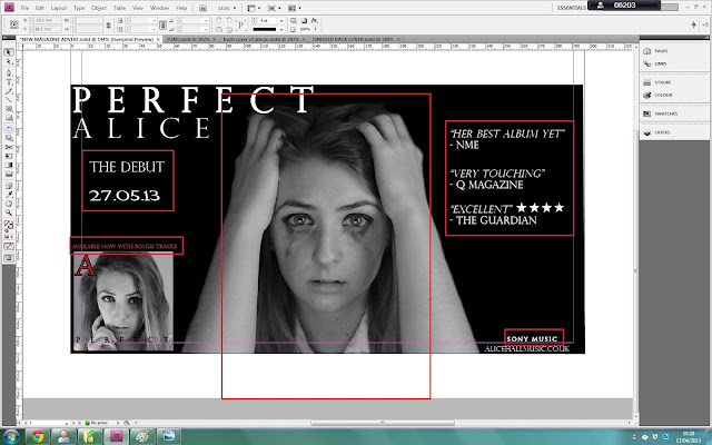
I have highlighted on the screen shot above the changes that have been made within the production of our magazine advert. We centered the image of Alice to make her the most prominent feature on the advert as the advert is promoting her song. We added ratings from popular music magazines and newspapers which allow a link to be made into real media products as we have seen this on real magazine adverts in our research. We also changed the colour of the 'Available now' text box to draw more attention to the fact that her songs are available for purchase, we changed it to red which links with the red 'A' on the album front cover. We also added a 'Debut' text box with a date of release for the whole album so that our target audience of teenagers and young people were aware of when the whole album will be out for sale. We have used the same font throughout our whole production of both ancillary tasks as this promotes strong continuity and allows our target audience to link all of our products together.
I have highlighted above the similar factors between the newest magazine advert with our other ancillary task. By using the same features on both products we are able to link all of our work together to convey a clear thinking process. We aimed for our products to link together well in order to promote a strong product, we have used a picture of the frontal album cover on the magazine advert so that our target audience are aware of the album that is being promoted. We have also used the same 'SONY MUSIC' text from the CD disk and back of album cover on the magazine advert to portray the music company which links to real media products. By making these changes to our magazine advert we have been able to create a more professional looking advert and it also looks less plain and simple by adding more information about the product we are promoting.
This is our final magazine advert:


No comments:
Post a Comment